The Edge
BRANDING
SQUARESPACE WEBSITE DESIGN
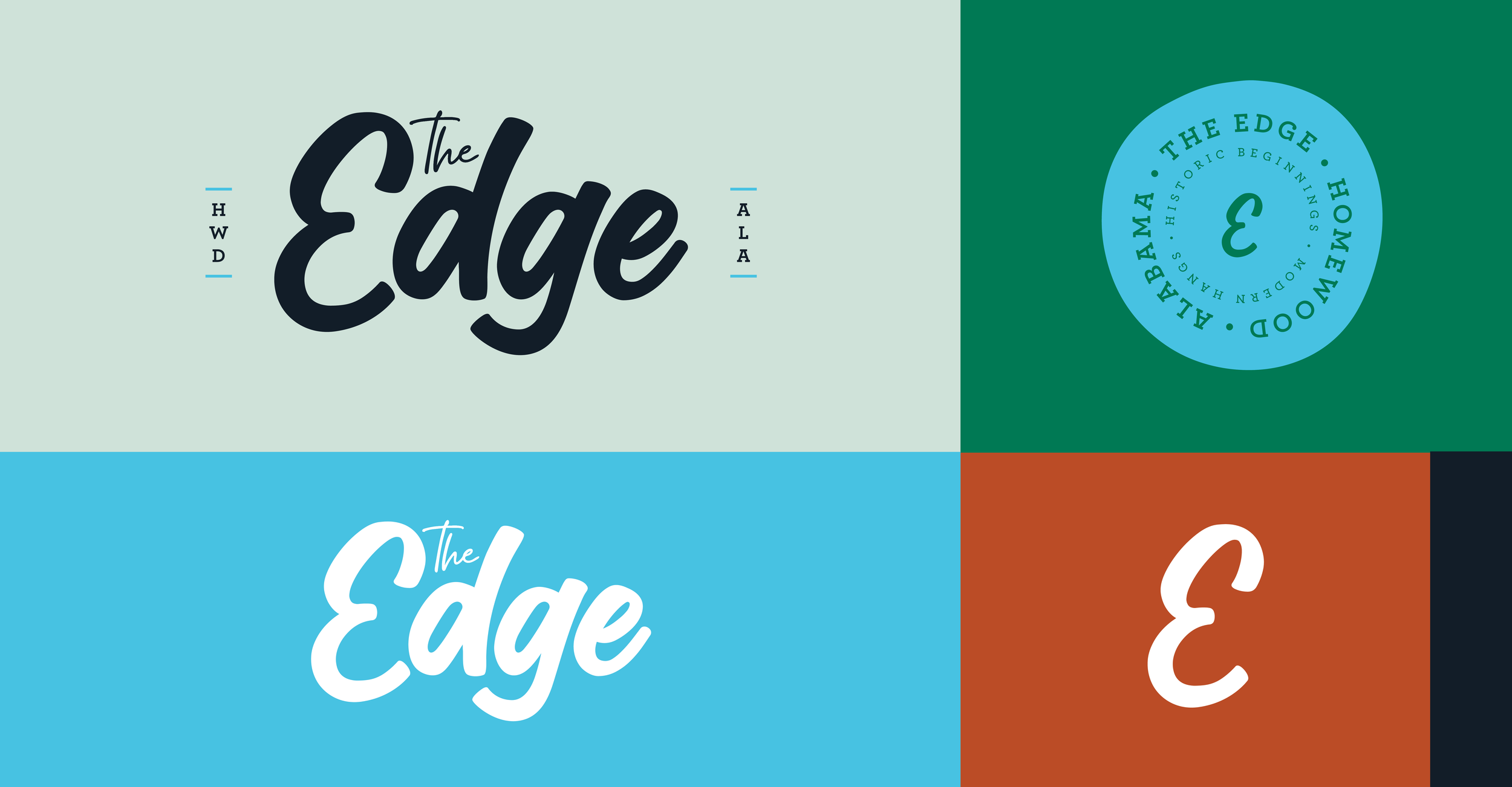
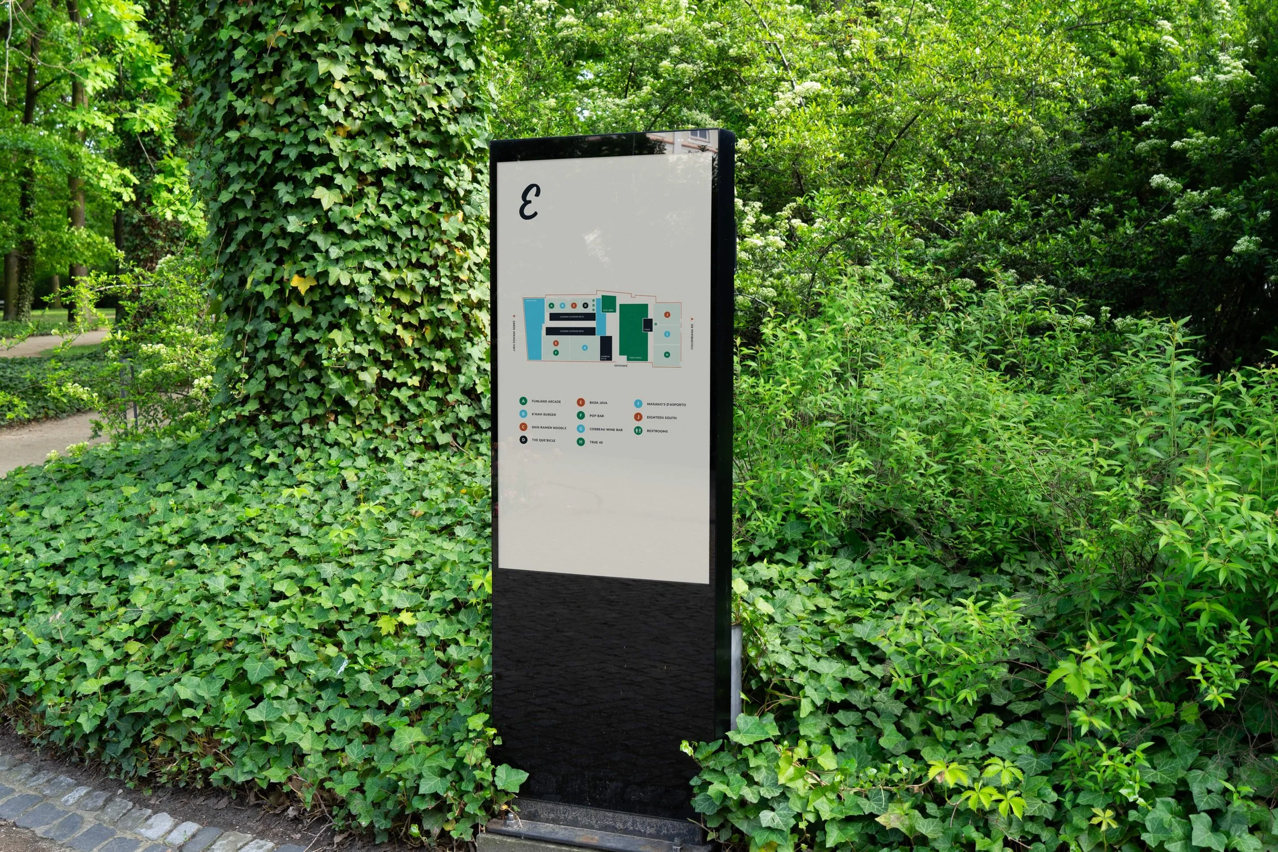
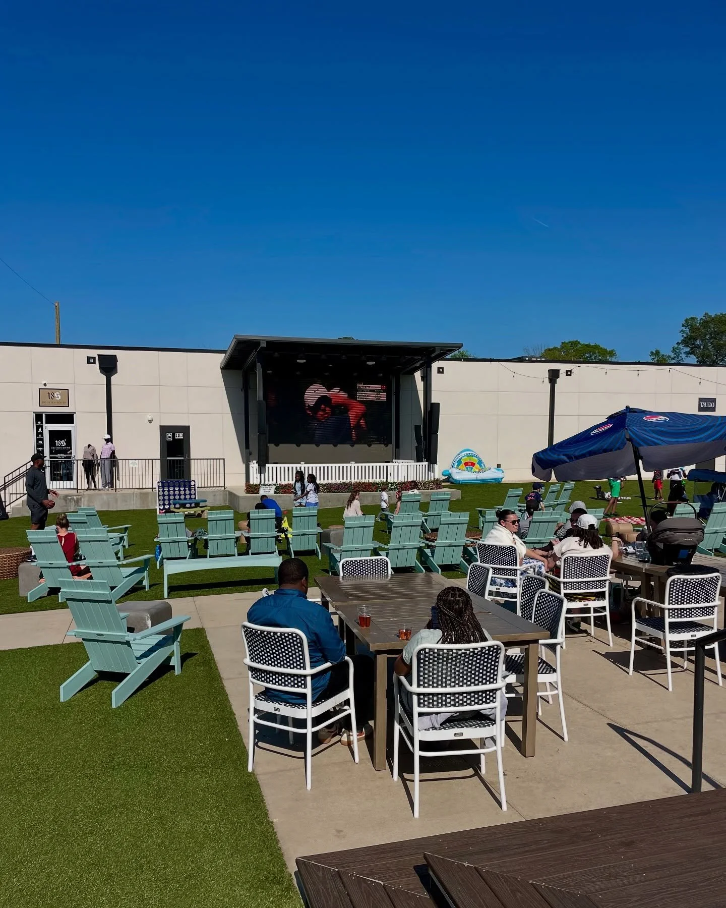
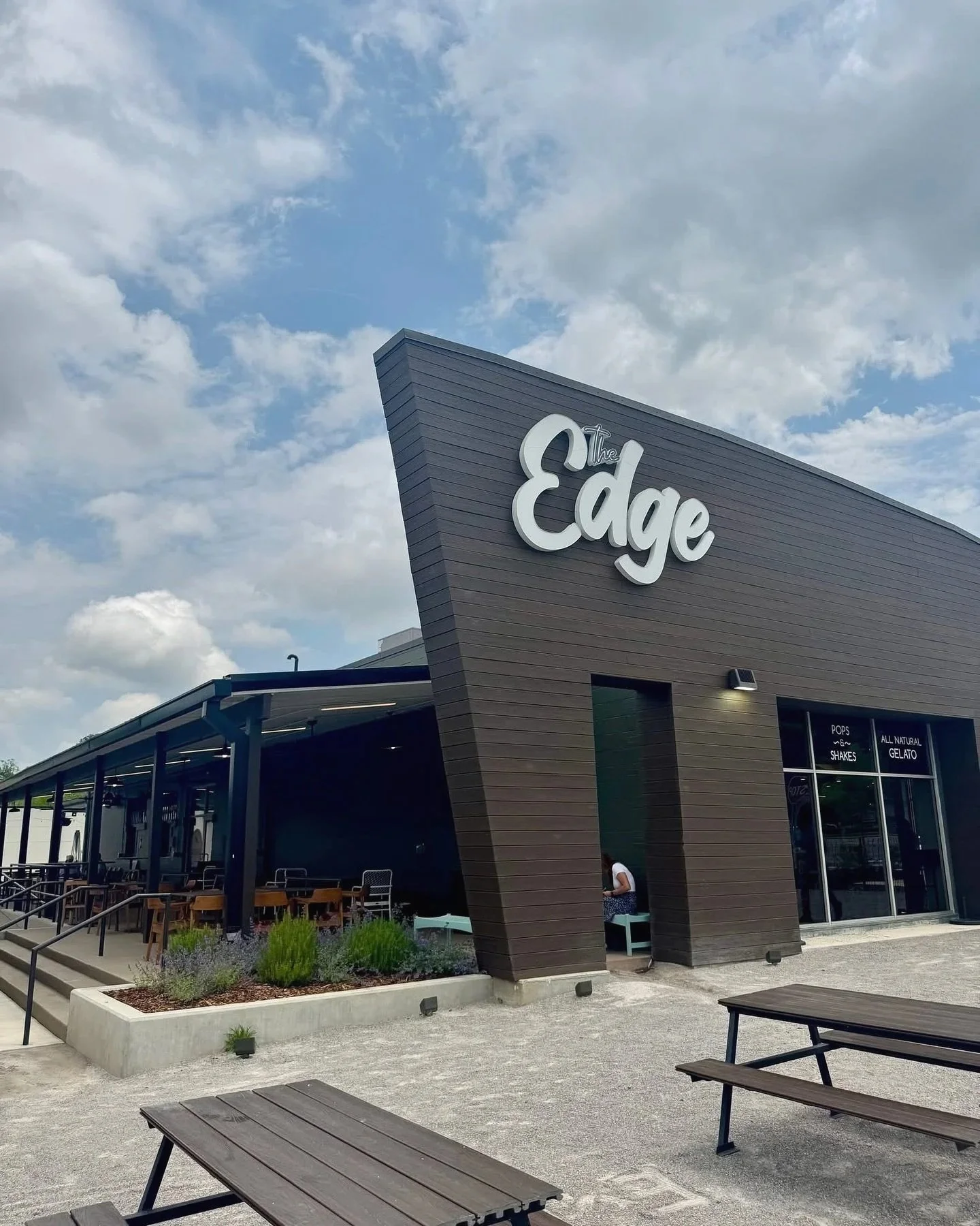
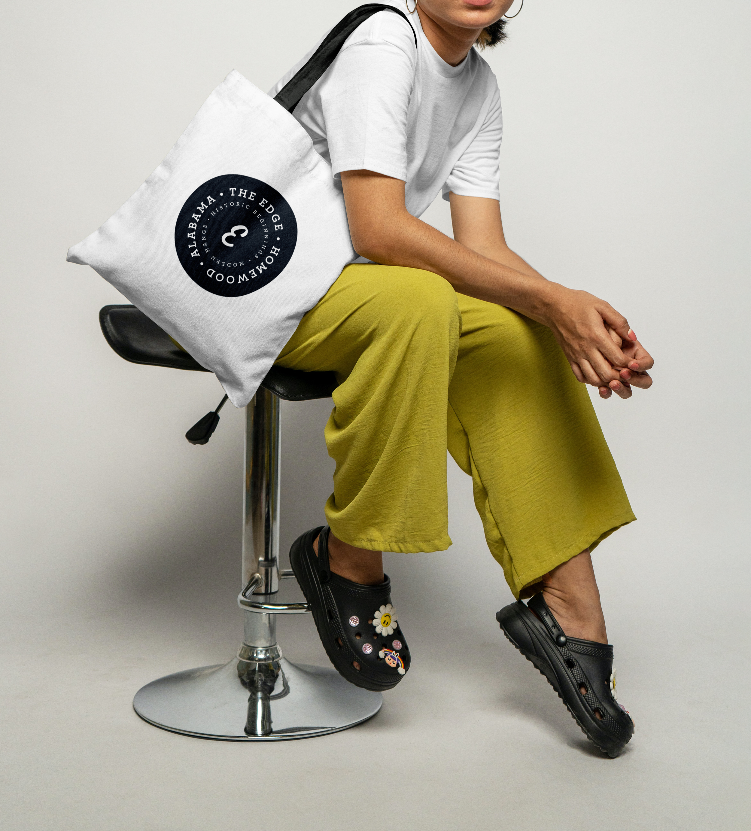
As the co-lead designer for The Edge, I partnered with their team to create a brand identity for a new community space they were developing. Their main priority was to appeal to families in the area, and throughout our conversations the word “approachable” became the guiding theme for the logo and overall look and feel.
I collaborated with another designer on the project, each of us presenting a unique logo direction. Ultimately, the client chose a blend of our concepts, which I refined into the final design. To capture the playful, welcoming tone they wanted, I hand-drew the lettering for “Edge,” giving the brand a distinctive, personal character.
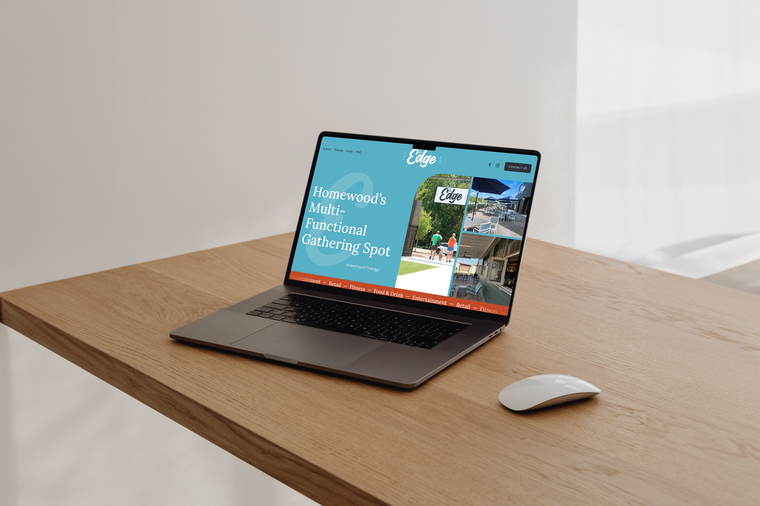
Once the brand identity was complete, I worked with the team to extend the design into a website. The site was built to serve as a central hub for the community, with functionality that made it easy to explore tenant information, browse menus, and check operating hours. I also integrated an events calendar so visitors could quickly see what was happening each month.
The final outcome was an approachable and family-friendly brand paired with a functional website that brought the new community space to life and gave residents a digital gathering place.
*project created at AMD Creative in collaboration with the Creative Director, Mary Kalusche